Context
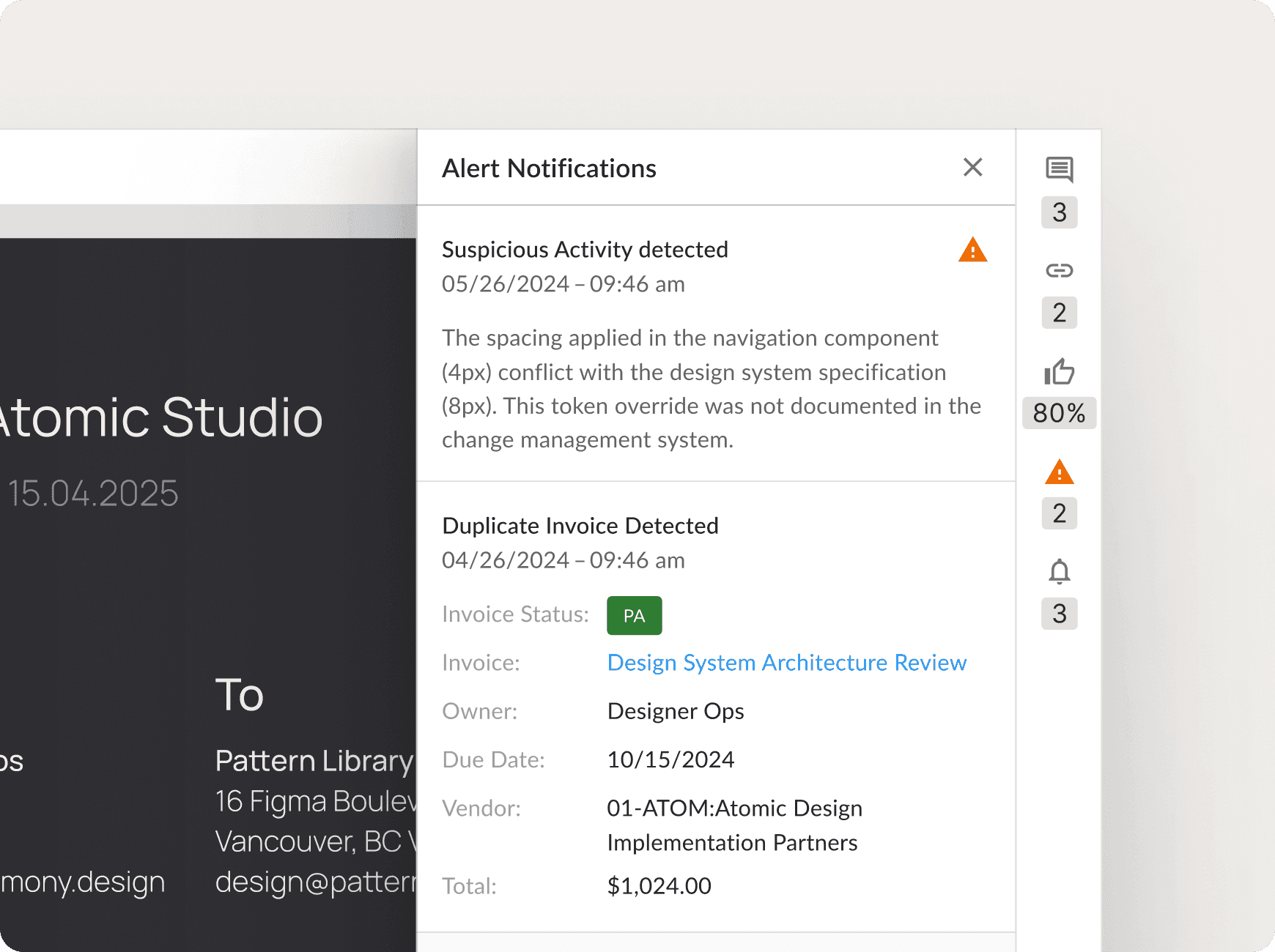
In 2025, my team at Quadient AP tasked me with designing a new Fraud Alert feature. During my preliminary analysis of the existing interface, I found a significant underlying problem: the UI was built with several different hardcoded card elements, even for the same type of content.
This was causing clear visual inconsistencies and creating a growing amount of technical debt. I realized that simply designing another hardcoded alert would only make the platform harder to maintain in the long run.

Championing a Systemic Solution
Seeing a larger opportunity, I put together a proposal for the Product Manager and the VP of Product. I presented my audit findings, showing the redundant code and inconsistent user experience. I argued that the best path forward wasn't just to build a single feature, but to invest in a reusable component that would solve the problem at its root.
My proposal was successful. My goals were now twofold:
Deliver the new Fraud Alert feature for the user.
Design and build a single, scalable card component that could be used for the fraud alert, replace the old hardcoded elements, and serve future needs.
My Role & Contribution
As the Product Designer responsible for the design system at Quadient AP, I led the design for this initiative. I collaborated closely with my Product Manager and front-end developers, and my responsibilities included:
Auditing the existing UI to identify inconsistencies and opportunities for a systemic solution.
Proposing and advocating for the creation of a reusable card component.
Designing the new card component, iterating through multiple versions based on feedback and technical considerations.
Creating detailed mockups and interactive prototypes.
Developing comprehensive handoff documentation, including specs, API references, and usage guidelines.
Working alongside developers to ensure the component was implemented accurately and met their needs.
My goal shifted from designing a single feature to creating a reusable card component that would establish design consistency and reduce technical debt for the entire platform.
Uncovering the Core Issues
My initial audit of the platform's UI panels confirmed we had a systemic issue, not just minor inconsistencies.
Key issues identified:
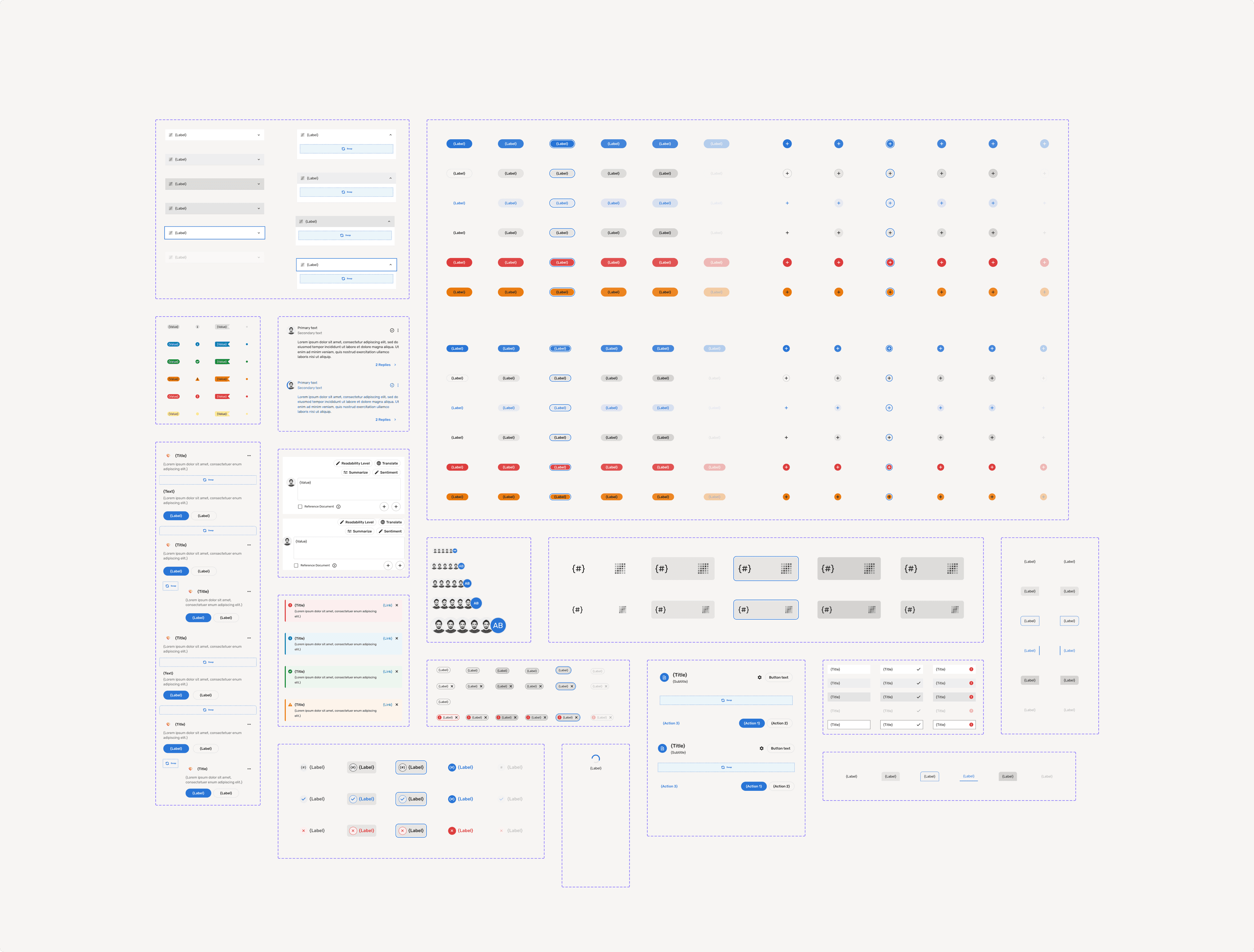
Multiple Hardcoded Variations: I found over four different, hardcoded card layouts being used within the same panel, each with its own unique styling and structure.
Poor Visual Hierarchy: Important information was often difficult to scan, and layouts lacked a clear, consistent structure, leading to a confusing user experience.
Growing Technical Debt: For developers, creating any new card-like UI meant copying old, often problematic code. This made maintenance a nightmare and slowed down development.

Designing the Solution
The design phase focused on creating a flexible, reusable card component using MUI’s atomic components as a base.
Defining Core Elements: Based on the audit, I identified the essential elements and variations needed for the card (e.g., title, subtitle, status indicators, actions, content area).
Iterative Prototyping & Testing: I created several design iterations, testing them with real data and content scenarios to ensure responsiveness and usability. For example, an early version used an incorrect component for status display, which a developer flagged. This led to layout adjustments to ensure technical feasibility. We went through four main layout iterations based on team feedback.

Handoff & Documentation
To ensure a smooth implementation and future usability, I developed comprehensive documentation:
Detailed Specs: I created thorough documentation using Specs, covering all subcomponents, design tokens (colors, spacing, typography), API references, and defined variations of the card.
Developer-Specific Guidance: I tailored parts of the documentation to address front-end limitations and specific requirements, based on discussions with the development team.
Usage Examples & Guidelines: I included clear examples of how to implement the card for different use cases, along with responsive behavior guidelines.

Impact & Results
The new card component delivered immediate and significant value, directly addressing our initial goals of improving consistency and reducing technical debt.
Increased Developer Efficiency & Reduced Tech Debt: The reusable component and its comprehensive documentation were highly praised by the development team. By providing a single, well-documented solution, we significantly reduced the time and effort needed to build new UI elements, directly tackling our technical debt.
Improved QA and Review Efficiency: The QA team reported that their review process became much more efficient. With a single, predictable component replacing dozens of inconsistent ones, they could test and approve new designs faster and with greater confidence.
A New Standard for Collaboration & System Thinking: Beyond the technical improvements, this project set a new precedent for design and development collaboration at Quadient AP. It built strong support for a component-based approach and proved the tangible value of investing in the design system. The improved documentation process has already shown promise by reducing QA review time while enhancing development efficiency overall.
This project not only delivered the required Fraud Alert feature but also laid a stronger, more scalable foundation for future UI development at Quadient AP.