Context
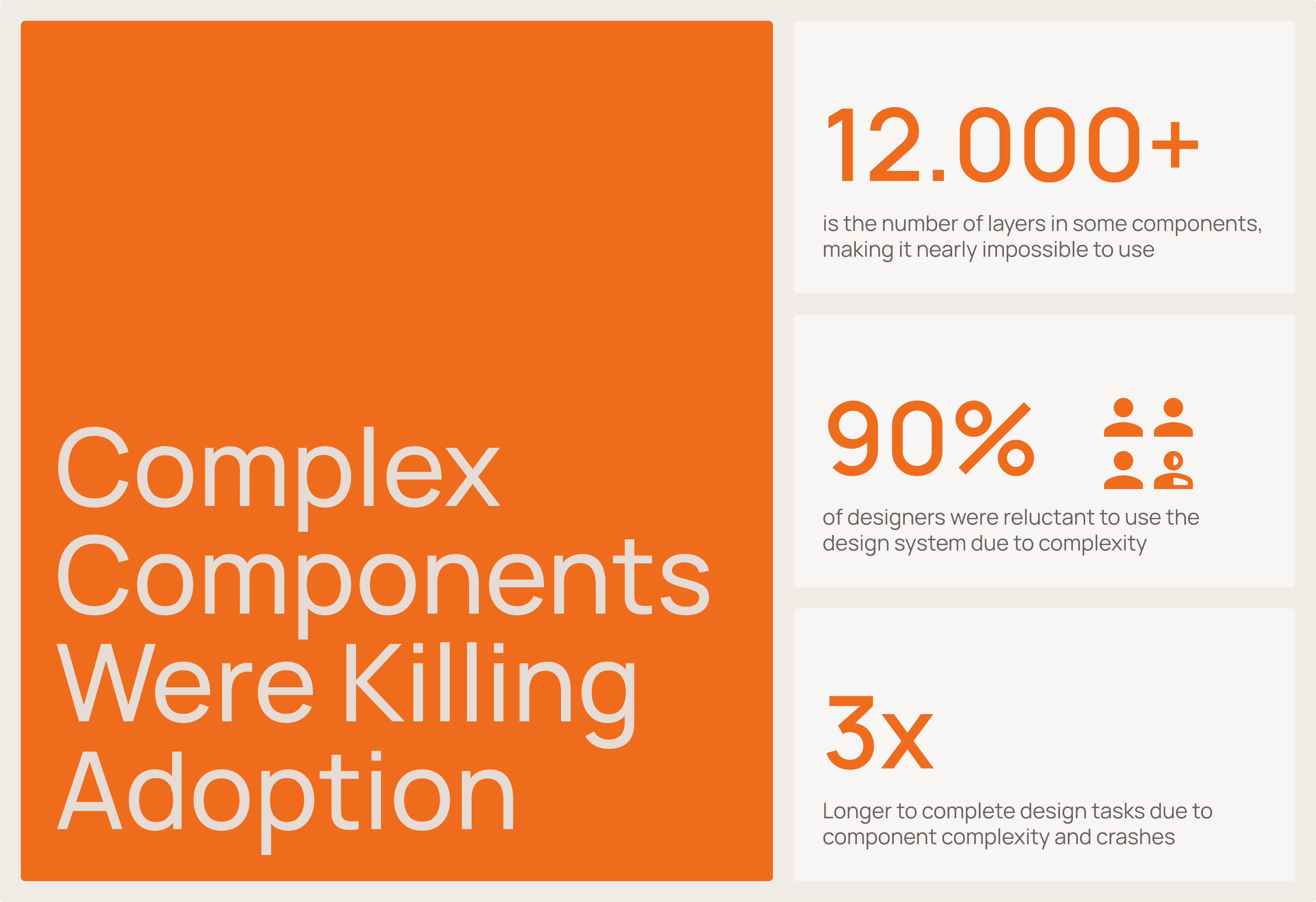
Quadient's ICA Design System was meant to empower multiple software teams across the globe. However, it had become a source of daily frustration. Components were incredibly complex—some with up to 12,000 layers in Figma—leading to frequent crashes that crippled designer productivity. Inconsistent styles, a disorganized component architecture, and a disconnect between design and code meant that instead of speeding things up, the system was slowing everyone down. Adoption was low, and designers were struggling. Something had to change.
My Role
I was a key member of the team tasked with refactoring the ICA Design System. My role evolved significantly, especially when team changes occurred mid-project. My core contributions included:
Co-developing a new, simplified component architecture framework.
Leading the design efforts for refactoring multiple complex components.
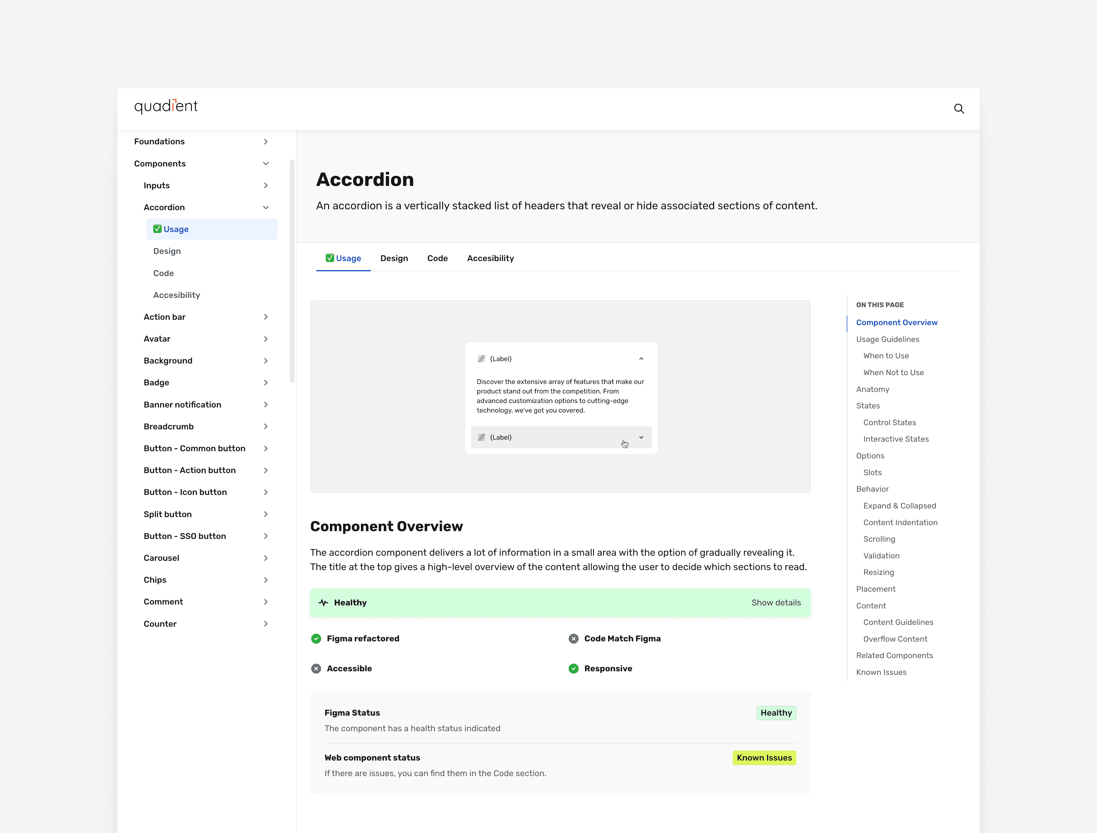
Co-designing a new documentation framework that became the standard for all component guidelines.
Co-leading quality assurance, including peer reviews and optimizing developer handoffs.
Stepping up to mentor and onboard a new designer during a critical transition period, ensuring our team maintained momentum and quality.
Our Investigation
To truly fix the system, we first needed to understand the full extent of its issues. Our investigation involved:
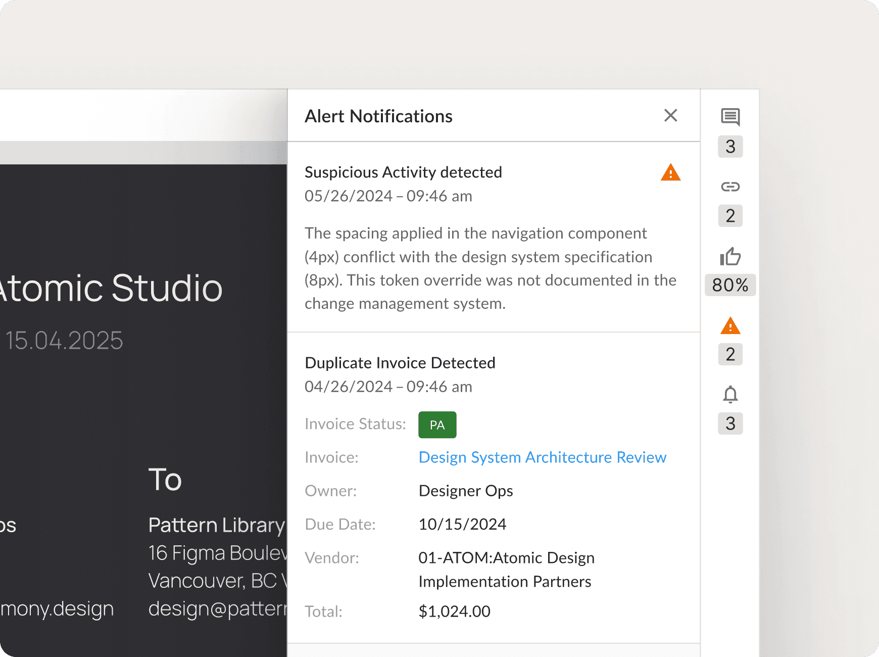
Talking to Our Users: We interviewed designers and developers who used the system daily. They shared stories of constant Figma crashes (4-5 times a day for some!), the struggle to find or modify components, and the creative (but inefficient) workarounds they’d developed.
Auditing Performance & Structure: We dug into the Figma files. The 12,000-layer components weren't just an anomaly; they were a major performance bottleneck. We also audited the component organization and naming conventions, finding widespread inconsistencies between design and code.
Checking Accessibility: Our accessibility audit revealed that many color combinations failed contrast standards, highlighting an immediate area for improvement in our color tokens.
This deep dive gave us clear priorities: simplify components, standardize naming, align design with code, boost performance, and create truly usable documentation.
Strategy First
We knew that just diving into redesigning individual components wouldn't solve the underlying systemic issues. So, we started by establishing a solid foundation:
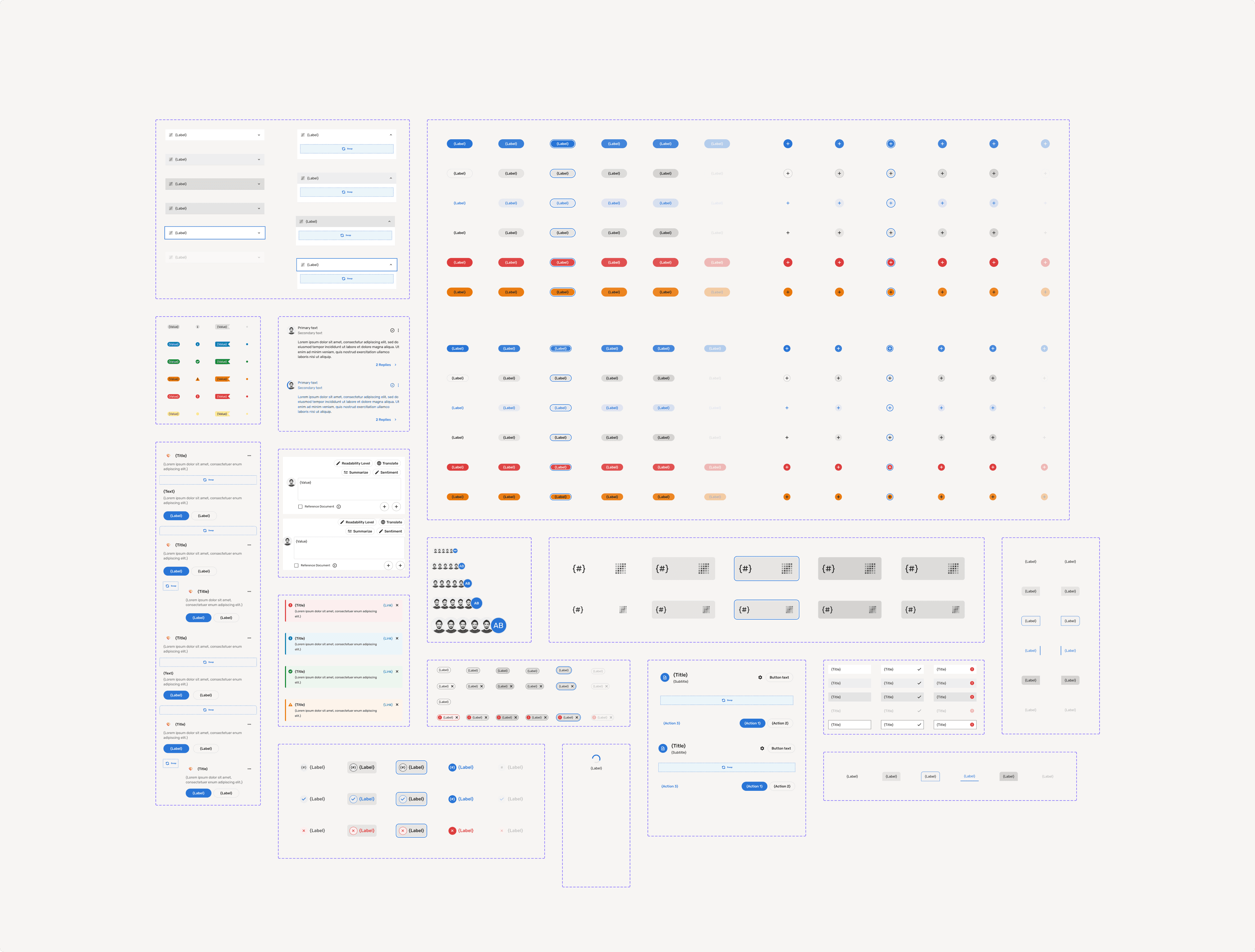
Clear Guidelines & Standards: We developed structured checklists, standardized naming conventions, and decision trees to guide the refactoring process and ensure consistency.
Robust Review Process: We implemented a peer review system with checkpoints to maintain quality throughout.
The Refactoring Journey
With our framework in place, we began the intensive work of refactoring. Our focus was on:
Simplifying Component Architecture: Making components easier to understand, use, and modify.
Standardizing Naming Conventions: Creating consistency across the system and between design and code.
Aligning Design with Code: Reducing discrepancies to ensure smoother handoffs to development.
This phase wasn't without its challenges. When two designers left mid-project and a new one joined, I took on a greater leadership role. I focused on mentoring our new team member and keeping our refactoring efforts on track, ensuring we didn’t lose momentum.
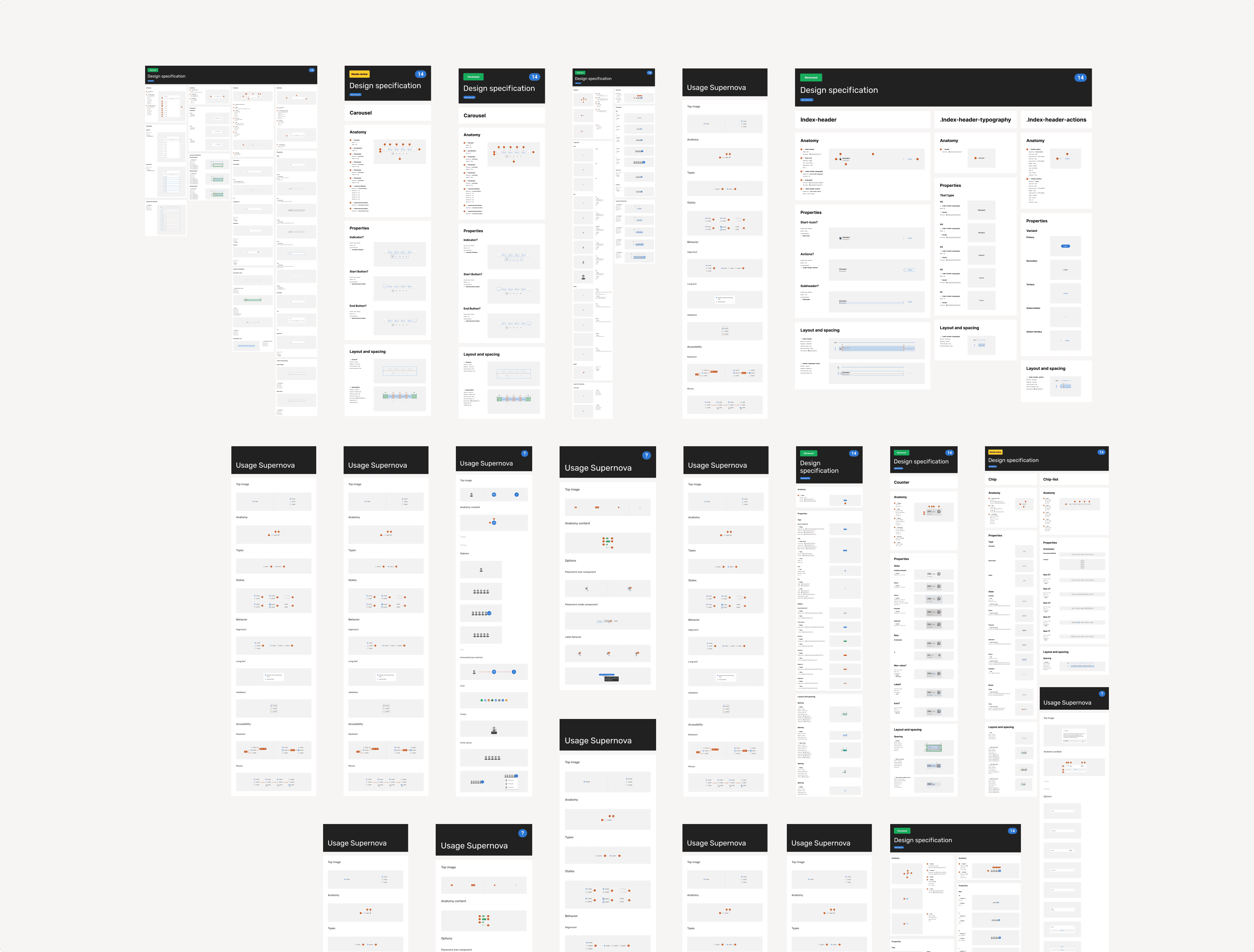
Documentation & Handoff

o make sure our improvements stuck and the system would be adopted, we focused heavily on documentation:
We maintained rigorous peer reviews for all documentation.
We developed an AI-assisted workflow to help generate initial drafts quickly, but human oversight and refinement (including engaging a professional copywriter) were critical to ensure the content was clear, concise, and truly usable.
Measurable Results
While the full code implementation of every refactored component is still in progress, the impact of our work on the design side has been transformative:
Complexity Slashed by over 60%: We dramatically simplified components. That notorious 12,000-layer pattern? It’s now a lean 800 layers. Figma crashes are a thing of the past.
Productivity Skyrocketed: Designers are now completing tasks 2-3 times faster.
Consistency Achieved: The system now provides a unified look and feel across products, strengthening brand cohesion.
User Satisfaction Soars: The feedback has been overwhelmingly positive. As one designer put it: “Before this refactor, I dreaded opening Figma because it would crash constantly—now everything just works.”
This project turned the ICA Design System from a bottleneck into a powerful tool that empowers both designers and developers.